PhoenixLiveGantt
A Phoenix LiveView Gantt chart component: horizontal bars on a time axis, dependency arrows between them, sub-projects with roll-up bars, corner badges, click-to-detail popovers, expand/collapse hierarchy, and a built-in geometry audit.
Phoenix-native, not a JavaScript wrapper — this is the part that's
different. Every bar, column, dependency-arrow route, milestone, and
sub-project roll-up is computed in Elixir and rendered as plain HTML + SVG
straight over the LiveView socket — there's no charting JS library, no
<canvas>, and no npm dependency to wire up. The only JavaScript is two
small, optional hooks (click-to-open popover and scroll-to-today); the chart
draws fine without them. So it behaves like any component you already own — it
speaks ~H, assigns, and phx-click, survives LiveView diffs, and styles
with your app's Tailwind/daisyUI tokens. Most "Elixir gantt" packages wrap a
JavaScript chart library; this one is Phoenix all the way down, so the
dependency graph, the routing math, and the rendering are all things you can
read, test, and override in Elixir.
The gantt/1 component is render-only: you give it events with start/enddates and it draws bars, columns, connectors, and frames. It has no concept
of durations, working hours, or scheduling. If your domain has durations + an
order + sub-projects but no dates, the optional PhoenixLiveGantt.Layout.sequential/2
helper does that translation for you (sequential waterfall, sub-project span,
day-aligned min span) with a pluggable calendar callback — see
Laying out from durations.
Installation
def deps do
  [
    {:phoenix_live_gantt, "~> 0.1"}
  ]
end
There are three wiring steps — deps, JS, and CSS. Skipping the CSS step is the most common mistake; the chart renders but library-specific styling is silently missing (see below).
1. JS hooks
The popover, fade-on-open, and auto-scroll-to-today behaviours need the JS
hooks. In your app.js:
import "../../deps/phoenix_live_gantt/priv/static/assets/phoenix_live_gantt.js"

let liveSocket = new LiveSocket("/live", Socket, {
  hooks: { ...window.PhoenixLiveGanttHooks, ...myHooks }
})
The bars render without the hooks, but clicking a bar/label won't open its popover and the today-button / auto-scroll won't work.
2. CSS / Tailwind (required)
PhoenixLiveGantt ships no stylesheet. Its visuals are Tailwind utility classes
that live inside the component's template (.ex source in deps/phoenix_live_gantt).
Tailwind only emits CSS for classes it can see, so you must add the package
to your content sources, or library-specific classes (the sub-project
pattern-fill, text-[0.6rem] connector labels, non-working-day shading,
badge sizing, …) get purged and the chart looks subtly broken.
Tailwind v4 — add an @source to your app.css:
@import "tailwindcss";
@source "../../deps/phoenix_live_gantt/lib";
Tailwind v3 — add a glob to content in tailwind.config.js:
module.exports = {
  content: [
    "./js/**/*.js",
    "../lib/my_app_web/**/*.*ex",
    "../deps/phoenix_live_gantt/lib/**/*.*ex"
  ]
}
PhoenixLiveGantt uses daisyUI semantic color tokens (bg-primary,
text-base-content, bg-success, …). daisyUI isn't required — every color is
overridable per attr (see bar_default_color_class and friends) — but the
defaults assume those tokens resolve to something.
Quick check that CSS is wired: a sub-project's roll-up bar should show a diagonal hatch pattern and connector labels should be legible. If bars are flat-colored and labels invisible, your content source is missing.
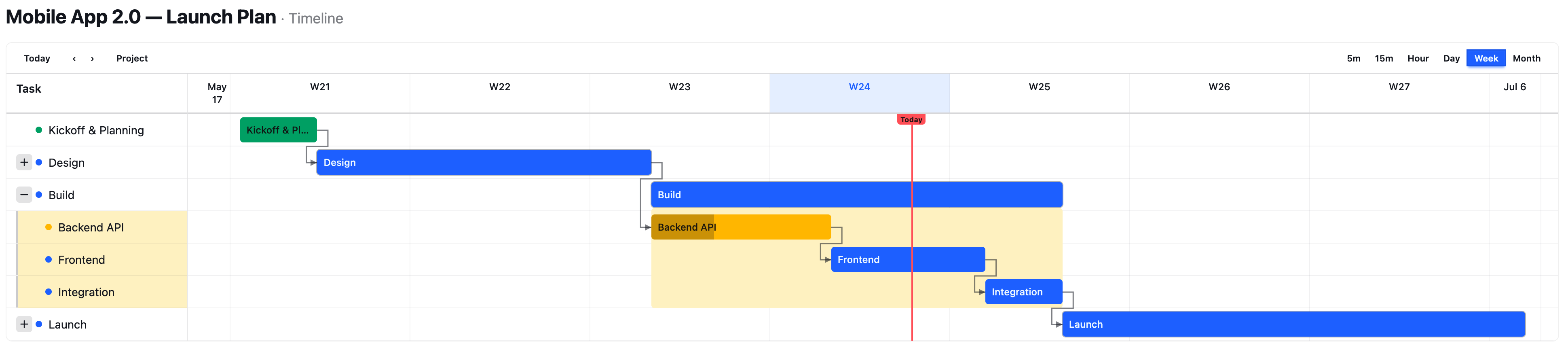
Basic usage
<PhoenixLiveGantt.gantt
  id="project"
  events={@tasks}
  date_range={@range}
  connectors={@connectors}
  zoom={:week}
  today={@today}
/>
A task is a PhoenixLiveGantt.Task struct:
%PhoenixLiveGantt.Task{
  id: "cut-wood",                # unique within the chart; connectors + parent_id reference this
  title: "Cut planks to length",
  start: ~D[2026-04-01],
  end: ~D[2026-04-04],           # EXCLUSIVE — see "Dates → bars" below
  color: "bg-primary",
  assignee: "Sara",
  progress_pct: 60,
  extra: %{}                     # badges, actions, parent_id, per-task overrides
}
date_range is a Date.Range (Date.range(first, last)) for the visible
axis. Pass id whenever you use the built-in toolbar (show_header) or
auto-scroll, and always when more than one chart shares a page — DOM ids and
JS dispatches are namespaced by it.
See PhoenixLiveGantt.gantt/1 for the full attr list (there are many styling hooks,
all with sane defaults) and PhoenixLiveGantt.Task for all task fields.
Live updates
It's a plain LiveView component, so it's live for free: re-assign events
(or connectors) and it re-renders — LiveView diffs only what changed down to
the client. There's no chart-specific update API, no pushEvent, nothing
imperative. The geometry is percent-based (no JS re-measurement on every render)
and the JS hooks restore popover/fade state across diffs, so even frequent
updates don't flicker or drop an open popover.
Where the data comes from is yours — the component is render-only and has no
opinion about it. The usual pattern is Phoenix.PubSub: subscribe on connect,
and on a broadcast reload the events and re-assign them.
def mount(%{"id" => id}, _session, socket) do
  if connected?(socket), do: Phoenix.PubSub.subscribe(MyApp.PubSub, "project:#{id}")

  {:ok, assign(socket, id: id, events: load_events(id), connectors: load_connectors(id))}
end

# Anything that mutates the project broadcasts on that topic — this LiveView,
# a controller, an Oban job, a console session; it doesn't matter.
def handle_info({:project_changed, _id}, socket) do
  id = socket.assigns.id
  {:noreply, assign(socket, events: load_events(id), connectors: load_connectors(id))}
end
Every connected viewer re-renders on the same broadcast, so one person's edit
shows up on a wall-mounted dashboard with no refresh. Polling or a manual
"refresh" button work identically — the component only cares that events
changed.
Making it interactive
By default the chart is static — bars render, but nothing is clickable.
Interactivity is opt-in via enable_hooks (the JS bundle from step 1 must be
registered) plus an id:
<PhoenixLiveGantt.gantt
  id="project" events={@tasks} date_range={@range}
  enable_hooks={true}
  on_event_click="task_clicked"
/>
enable_hooks turns on: click a bar/label to open its detail popover (with
dependency-tree highlight), keyboard activation (Enter/Space open it, Escape
closes and restores focus), and today auto-scroll.
Built-in toolbar
show_header={true} renders a toolbar — zoom switcher, Today button, prev/next:
<PhoenixLiveGantt.gantt
  id="project" events={@tasks} date_range={@range} today={@today}
  show_header={true}
  zooms={[:hour, :day, :week, :month]}   {!-- which zoom buttons appear --}
  on_zoom_change="set_zoom"
  on_navigate="navigate"
/>
show_zoom_switcher / show_today_button / show_navigation hide individual
pieces; the :toolbar_start / :toolbar_end slots drop your own controls in.
Server callbacks
Each interaction is a plain phx-click you handle in your LiveView:
| attr | fires when | param |
|---|---|---|
on_event_click | a bar/milestone is clicked | %{"event-id" => id} |
on_toggle_expand | a sub-project chevron is toggled | %{"event-id" => id} |
on_zoom_change | a zoom button is clicked | %{"zoom" => "week"} |
on_navigate | prev / next is clicked | %{"direction" => "next"} |
on_show_earlier / on_show_later | a "← N earlier / N later →" button | (no extra params) |
on_show_today | the off-screen "← Today" pill | (no extra params) |
(The key is "event-id" with a hyphen.)
Popover actions & corner badges
Per-task buttons and badges live on extra:
%PhoenixLiveGantt.Task{
  id: "build", title: "Build", start: ~D[2026-04-01], end: ~D[2026-04-05],
  extra: %{
    actions: [
      %{icon: "hero-pencil", tooltip: "Edit",
        phx_click: "edit", phx_value: %{id: "build"}},
      %{icon: "hero-arrow-top-right-on-square", tooltip: "Open", href: "/tasks/build"}
    ],
    badges: [
      %{content: "3", corner: :top_right, color: "bg-error"},   # e.g. a blocker count
      %{content: "!", corner: :bottom_left, flash: true}
    ]
  }
}
Actions render as buttons inside the click-popover (so they need enable_hooks);
each takes icon (required) plus any of tooltip, phx_click, phx_value,
phx_target, href, class. Badges pin to a corner
(:top_left | :top_right | :bottom_left | :bottom_right, default :top_right)
with optional color, text_color, flash, class.
Translations
There are two layers, and they're deliberately separate:
Chrome — the chart's own strings (toolbar buttons, the Today label, prev/next, the "N earlier / later" counts, popover + expand/collapse labels, and short month names). Pass a
translationsmap; anything you omit falls back to English. No chrome text is hard-coded.translations = %{labels: %{today: "Aujourd'hui", week: "Semaine", day: "Jour", task: "Tâche",prev: "Précédent", next: "Suivant",earlier_tasks: "%{count} avant", later_tasks: "%{count} après"# ... see PhoenixLiveGantt.Utils.I18n for the full key list},month_names_short: %{1 => "janv", 2 => "févr", 3 => "mars", ...}}<PhoenixLiveGantt.gantt events={@tasks} date_range={@range} translations={translations} />Content — task titles, assignees, action tooltips. You pass these already localized as plain strings in each
PhoenixLiveGantt.Task. The library never stores or resolves content, so it works with any backend: gettext, Cldr, or a JSONB multilang column — resolve the string for the current locale however you already do, and hand it over astitle.%PhoenixLiveGantt.Task{id: a.id, title: localized_title(a, @locale), ...}
So localization is fully in your control: chrome via one map, content via the strings you already produce.
Accessibility
The chart is built for keyboard and screen-reader use when enable_hooks is on:
- Bars, milestones, and label rows are focusable (
tabindex="0",role="button",aria-haspopup="dialog"); Enter/Space open the popover (and fireon_event_click), Escape closes it and returns focus to the trigger. - The popover is a
role="dialog"with anaria-label; sub-project chevrons exposearia-expanded; toolbar zoom buttons usearia-pressed; prev/next and the edge buttons carryaria-labels. All these strings come from thetranslationsmap, so they localize too. - The connector/arrow SVGs are decorative (
aria-hidden), so a screen reader walks the bars, not the geometry.
Two things are on you: task status is conveyed by bar color — if that
distinction matters to your users, encode it in the title/an action/a badge
too (don't rely on color alone); and the geometry is LTR-only (see Gotchas).
Dates → bars
How a task's start/end become a bar — worth reading once, because end
being exclusive trips people up:
endis exclusive. A bar covers[start, end). A task that occupies just April 1 isstart: ~D[2026-04-01], end: ~D[2026-04-02]. Ifendisnil,PhoenixLiveGantt.Task.effective_end/1fills it in:start + 1 dayfor aDate,+30 minfor aDateTime/NaiveDateTime.- Milestones. When
end <= start(zero duration) the task renders as a diamond instead of a bar. Anil-endtask with no children is a milestone too. - Bar width is honest by default (
min_bar_px: 0): a bar is exactly as wide as its duration, so a task too short to see at the current zoom is a hairline (and gets a "too small to see" marker — seetiny_bar_px). Setmin_bar_pxto e.g.4to floor every bar to a visible sliver. - Out-of-range events are dropped, not clipped. A task entirely outside the
visible window isn't rendered; instead it's counted into the
"← N earlier / N later →" edge indicators. Wire
on_show_earlier/on_show_laterto let users widen the range. - Zoom (
:min5/:min15/:hour/:day/:week/:month) only changes column grouping and pixels-per-day; it never changes which events are in range. The sub-day zooms render intra-day detail fromDateTime/NaiveDateTimestarts.
Sub-projects (hierarchy + roll-up)
Any event becomes a child of another by setting extra.parent_id to the
parent event's id. The parent renders as a roll-up bar spanning its
descendants, with an expand/collapse chevron and a framed band across both
columns.
Three things that aren't obvious and cost me time when I built the first consumer — they're the rules to internalize:
Always include every descendant in
events. The library decides an event is a sub-project (and draws the chevron) by finding other events that point at it viaparent_id. It then hides the children of collapsed parents itself. So you emit the full tree every render and letexpandedcontrol visibility — do not add children only when expanded, or a collapsed parent has nothing pointing at it and never gets a chevron.Let the parent's dates roll up — pass
start: nil, end: nil. A sub-project parent with nil dates is auto-sized to span its descendants' min start / max end. If you instead give the parent explicit dates (e.g. from a rolled-up duration), the library uses those and the children can visually spill outside the bar — you'd have to size the parent to its children yourself. Nil-and-let-it-roll-up is almost always what you want.on_toggle_expandfires with the param keyevent-id(hyphen, fromphx-value-event-id), and you own theexpandedset:# render<PhoenixLiveGantt.ganttevents={@events}date_range={@range}expanded={@expanded} # MapSet | list | :all | nilon_toggle_expand="toggle_subproject"/># the handler — note the hyphenated keydef handle_event("toggle_subproject", %{"event-id" => id}, socket) doexpanded = socket.assigns.expandedexpanded =if MapSet.member?(expanded, id),do: MapSet.delete(expanded, id),else: MapSet.put(expanded, id){:noreply, assign(socket, expanded: expanded)}end
expanded accepts a MapSet, a plain list, :all (everything expanded), or
nil (all collapsed). Connectors that point at a hidden child are
automatically retargeted to its nearest visible ancestor, so arrows never
dangle.
Laying out from durations
If your data has durations rather than dates, PhoenixLiveGantt.Layout.sequential/2
turns it into the dates gantt/1 wants — so you don't hand-roll (and re-bug)
the waterfall + sub-project-span + day-alignment yourself:
layout =
  PhoenixLiveGantt.Layout.sequential(tasks,
    start: ~D[2026-06-01],
    id: & &1.id,
    parent_id: & &1.parent_id,      # nil = top-level; others nest
    duration: & &1.hours,           # opaque — only your :advance interprets it
    order: & &1.position,
    advance: fn start_date, hours, task ->
      # your calendar: weekends, working hours, holidays — all live here
      MyApp.Calendar.add(start_date, hours, task)
    end
  )
# => %{id => %{start: ~D[...], end: ~D[...]}}

events =
  Enum.map(tasks, fn t ->
    %{start: s, end: e} = layout[t.id]
    %PhoenixLiveGantt.Task{id: t.id, title: t.title, start: s, end: e,
                    extra: %{parent_id: t.parent_id}}
  end)
It works entirely in Dates, so each item gets at least a one-day slot
(:min_span_days, default 1), siblings never overlap, and a sub-project's bar
always spans its laid-out children. The business calendar is yours (the
:advance callback); the library stays domain-agnostic. It does not do
dependency-driven scheduling, critical path, or resource leveling — supply your
own dates for those.
Connectors
Dependency arrows are plain maps referencing event ids:
%{from: "cut-wood", to: "assemble", type: :fs, critical: true, label: "2d lag"}
type—:fs(finish-to-start, default),:ss,:ff,:sf.- A connector whose
from/toisn't a visible event id is silently skipped (e.g. it points outsidedate_range). - A backward / impossible schedule (the dependent is laid out earlier than
the constraint allows) is auto-detected and drawn in the
invalidstyle (dashed, error color) — a free correctness check on your date mapping. critical: truedraws it in the critical style;labelannotates the line.
Debugging
mix phoenix_live_gantt.dumprenders a chart from a fixture and prints parsed bar geometry — handy for checking positions without a browser.PhoenixLiveGantt.Inspectorparses rendered HTML into geometry, andPhoenixLiveGantt.TestHelpersadds property assertions (bar containment, ordering, connector validity) you can use in your own tests.
Gotchas
The short list of things that bite, collected from building the first consumer:
- No CSS content source → chart renders but library-specific classes are purged. (See CSS step above — the #1 issue.)
endis exclusive → a one-day task needsend = start + 1, notend = start(which is a milestone diamond).- Every event needs a unique, non-nil
id→ anilor duplicate id raises (it would make connectors and popovers ambiguous). Validate your data, don't feed raw rows in blind. - An event with no
start(or no resolvable end) is silently dropped → it doesn't render and isn't even counted in the edge indicators. Give every event astart. todaydefaults toDate.utc_today()→ in a timezone-aware app, pass the viewer's owntoday/now, or the today line lands on the wrong column for non-UTC users.window_start/window_endare all-or-nothing → set only one (or makewindow_end <= window_start) and the whole sub-day window is silently ignored, falling back todate_range.- Sub-project children must always be in
events→ emit the full tree;expandedcontrols visibility. Adding children only when expanded breaks the chevron. - Give sub-project parents
nildates → so they roll up to span their children. Explicit parent dates can let children spill outside the bar. on_toggle_expandparam is"event-id"(hyphen), not"event_id".idis required withshow_header/ auto-scroll, and whenever two charts share a page (ids + JS dispatches are namespaced by it).- The JS bundle is effectively required. The
LgBarPopover/LgAutoScrollhooks ship inpriv/static/assets/phoenix_live_gantt.js(registered aswindow.PhoenixLiveGanttHooks).enable_hooks(defaultfalse) gates BOTH hooks; if you turn it on without registering the bundle you'll get "unknown hook" console errors. The popover and scroll-to-today need it. - Sub-project chevrons use heroicons (
hero-plus-mini/hero-minus-mini). Those classes exist only if your app has the heroicons Tailwind plugin (the default in Phoenix ≥ 1.7, but not universal). No plugin → no chevron glyph. dir="rtl"sets the attribute but the geometry is LTR-only — bars, the time axis, and connectors still run left-to-right. RTL text in labels renders fine; the chart layout does not mirror.
Large charts
Horizontal geometry is pure CSS (percent positions, no measurement), so wide timelines are cheap. The cost is the connector router: collision avoidance is roughly O(tasks) per connector, and a chart re-renders/serializes its full HTML over the LiveView socket. A few hundred tasks with dependencies at a fine zoom produces multi-MB diffs and second-scale re-renders. To keep big charts snappy:
- Set
avoid_collisions: false(component attr, or per-connector) to skip the obstacle pass — connectors may cross unrelated bars but routing is much cheaper. - Narrow
date_range(or pass awindow_start/window_end) so only the relevant slice renders; out-of-range tasks become cheap edge-indicator counts. - Prefer coarser zooms (
:week/:month) for overview; reserve:dayand the sub-day zooms for focused windows.
Status
Pre-1.0; API may shift. See CHANGELOG for breaking changes.
License
MIT