
Petal Components
About 🌺
Petal stands for:
Petal is a set of HEEX components that makes it easy for Phoenix developers to start building beautiful web apps.
Some components like Dropdowns require Javascript to work. We default to Alpine JS (17kb) but you can choose to use Phoenix.LiveView.JS as an alternative (though this will only work in live environments like live views or live components).
Docs 📄
- Install
- Roadmap
- Examples
Install
For Petal to work you simply need Tailwind CSS and Alpine JS installed along with with some Tailwind configuration.
Existing projects
1 - Follow this guide to install Tailwind and Alpine.
2 - Add Petal to your deps:
mix.exs
defp deps do
  [
    {:petal_components, "~> 0.5.1"},
  ]
end
3 - Modify your tailwind.config.js file to include these settings:
const colors = require("tailwindcss/colors");

module.exports = {
  mode: "jit",
  purge: [
    "../lib/*_web/**/*.*ex",
    "./js/**/*.js",

    // We need to include the Petal dependency so the classes get picked up by JIT.
    "../deps/petal_components/**/*.*ex"
  ],
  darkMode: false,
  theme: {
    extend: {

      // Set these to your brand colors
      colors: {
        primary: colors.blue,
        secondary: colors.pink,
      },
    },
  },
  plugins: [require("@tailwindcss/forms")],
};
4 - Alias the components in your <your_project>_web.ex file
defmodule YourProjectWeb
  ...

  defp view_helpers do
    quote do
      ...

      use PetalComponents
    end
  end
This will import the functions so you can go <.button /> in your templates / live views.
If the function names clash with yours (eg. you already have a .button function) you can opt to alias the modules instead:
defmodule YourProjectWeb
  ...

  defp view_helpers do
    quote do
      ...

      alias PetalComponents.{
        Heroicons,
        Alert,
        Badge,
        Button,
        Container,
        Dropdown,
        Form,
        Loading,
        Typography,
        Breadcrumb,
        Avatar,
        Progress
      }
    end
  end
New projects
We recommend using Petal boilerplate, which is a fresh Phoenix install with Tailwind + Alpine installed. It comes with a project renaming script so you can still rename your project to whatever you like.
Roadmap
Layout
- container
Form components
- text input
- select dropdown
- textarea
- checkbox
- radios
- errors
- labels
- file upload
- text variants (email, password, tel)
- color input
- range input
- time & datetime input
- multiple select
- switch
Buttons
- basic button
- change size
- change color
- loading state (with spinner)
- filled vs outline
- button group
Misc
- menu dropdown
- tooltips
- avatar
- alerts
- tables
- cards
- breadcrumbs
- modal
- slide over
- spinners
- accordian
- pagination
- badges
- progress
- links
Examples
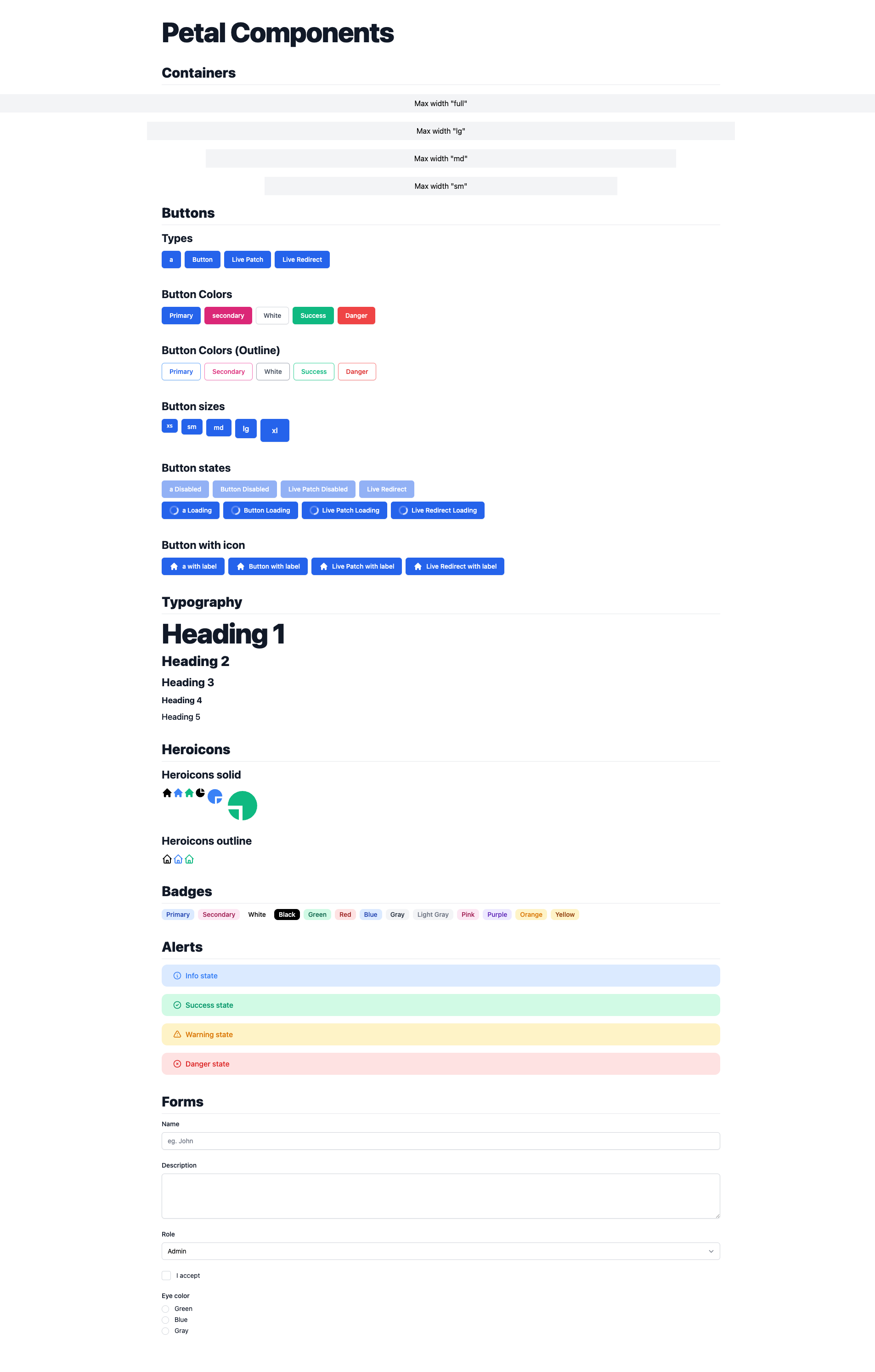
Containers
<Container.container max_width="full | lg | md | sm">
Links
Link types
<.link link_type="a | live_patch | live_redirect" to="/" class="" label="" />
Buttons
Button types
<.button label="Button" />
<.button link_type="a | live_patch | live_redirect" to="#" label="a" />
Button colors
<.button color="primary | secondary | white | success | danger" label="Primary" />
Button colors (outline)
<.button color="primary | secondary | white | success | danger" label="Primary" variant="outline" />
Button sizes
<.button size="sm | md | lg | xl">
Button states
Disabled
<.button disabled link_type="a | live_patch | live_redirect" to="/" label="Disabled" />
Loading
<.button loading link_type="a | live_patch | live_redirect" to="/" label="Loading" />
Button with icon
<.button icon>
  <Heroicons.Solid.home class="w-5 h-5" />
  With label
</.button>
<.button icon link_type="a | live_patch | live_redirect" icon to="/">
  <Heroicons.Solid.home  class="w-5 h-5" />
  With label
</.button>
Typography
<.h1>Heading 1</.h1>
<.h2>Heading 2</.h2>
<.h3>Heading 3</.h3>
<.h4>Heading 4</.h4>
<.h5>Heading 5</.h5>
Heroicons
Heroicons solid
<Heroicons.Solid.home class="w-6 h-6 text-blue-500" />
<Heroicons.Solid.render icon={:home} />
Heroicons outline
<Heroicons.Outline.home class="w-6 h-6 text-blue-500" />
<Heroicons.Outline.render icon={:home} />
Badges
<.badge color="primary | secondary | Info | Success | Warning | Danger | Gray" label="Primary" />
Alerts
Info alert
<.alert state="info">
  This is an info state
</.alert>
Success alert
<.alert state="success" label="This is a success state" />
Warning alert
<.alert state="warning" label="This is a warning state" />
Danger alert
<.alert state="danger" label="This is a danger state" />
Optional heading alert
<.alert heading="Optional heading">
  This is quite a long paragraph that takes up more than one line.
</.alert>
Forms
Inputs can take the same arguments as the equivalents in Phoenix.HTML.Form. Eg. <.time_input precision={:second} />.
Text input
<.text_input form={:user} field={:name} placeholder="eg. John" />

<!-- With a label, errors and bottom margin -->
<div class="mb-6">
  <.form_label form={f} field={:name} />
  <.text_input form={f} field={:name} placeholder="eg. John" />
  <.form_field_error form={f} field={:name} class="mt-1" />
</div>

<!-- Includes label, errors and bottom margin -->
<.form_field
  type="text_input"
  form={f}
  field={:first_name}
  placeholder="eg. John"
/>
Number input
Same as Text input but use <.number_input>.
Email input
Same as Text input but use <.email_input>.
Password input
Same as Text input but use <.password_input>.
Telephone input
Same as Text input but use <.telephone_input>.
URL input
Same as Text input but use <.url_input>.
Time input
Same as Text input but use <.time_input>.
Time select
Same as Text input but use <.time_select>.
Datetime input
Same as Text input but use <.datetime_local_input>.
Datetime select
Same as Text input but use <.datetime_select>.
Color input
Same as Text input but use <.color_input>.
File input
Same as Text input but use <.file_input>.
Range input
Same as Text input but use <.range_input>.
Text area
Same as Text input but use <.textarea>.
Select
<.select
  options={["Admin": "admin", "User": "user"]}
  form={f}
  field={:role}
/>

<!-- With a label, errors and bottom margin -->
<div class="mb-6">
  <.form_label form={f} field={:role} />
  <.select
    options={["Admin": "admin", "User": "user"]}
    form={f}
    field={:role}
  />
  <.form_field_error form={f} field={:name} class="mt-1" />
</div>

<!-- Includes label, errors and bottom margin -->
<.form_field
  type="select"
  options={["Admin": "admin", "User": "user"]}
  form={f}
  field={:role}
/>
Checkbox
<.checkbox form={f} field={:read_terms} />

<!-- With a label, errors and bottom margin -->
<label class="inline-flex items-center block gap-3 mb-6 text-sm text-gray-900 dark:text-gray-200">
  <.checkbox form={f} field={:read_terms} />
  <div>I accept</div>
</label>

<.form_field_error form={f} field={:read_terms} class="mt-1" />

<!-- Includes label, errors and bottom margin -->
<.form_field
  type="checkbox"
  form={f}
  field={:read_terms}
  label="I accept"
/>
Radios
<.checkbox form={f} field={:read_terms} />

<!-- With a label, errors and bottom margin -->
<.form_label form={f} field={:eye_color} />

<div class="flex flex-col gap-1">
  <label class="inline-flex items-center block gap-3 text-sm text-gray-900 dark:text-gray-200">
    <.radio form={f} field={:eye_color} value="green" />
    <div>Green</div>
  </label>

  <label class="inline-flex items-center block gap-3 text-sm text-gray-900 dark:text-gray-200">
    <.radio form={f} field={:eye_color} value="blue" />
    <div>Blue</div>
  </label>

  <label class="inline-flex items-center block gap-3 text-sm text-gray-900 dark:text-gray-200">
    <.radio form={f} field={:eye_color} value="gray" />
    <div>Gray</div>
  </label>
</div>

<.form_field_error form={f} field={:read_terms} class="mt-1" />

<!-- Includes label, errors and bottom margin -->
<.form_field
  type="radio_group"
  form={f}
  field={:eye_color}
  options={["Green": "green", "Blue": "blue", "Gray": "gray"]}
  label="Eye color"
/>
Dropdowns
Dropdowns require Javascript. You can choose whether to use Alpine JS or the Phoenix.LiveView.JS module.
Note that the Phoenix.LiveView.JS option only works in live components. For dead components you must use Alpine JS.
<.dropdown label="Dropdown" js_lib="alpine_js|live_view_js" placement="left|right">
  <.dropdown_menu_item>
    <Heroicons.Outline.home class="w-5 h-5 text-gray-500" />
    Button item with icon
  </.dropdown_menu_item>
  <.dropdown_menu_item link_type="button" label="a item" />
  <.dropdown_menu_item link_type="a" to="/" label="a item" />
  <.dropdown_menu_item link_type="live_patch" to="/" label="Live Patch item" />
  <.dropdown_menu_item link_type="live_redirect" to="/" label="Live Redirect item" />
</.dropdown>
Loading indicators
<.spinner show={false} />
<.spinner show={true} size="sm" />
<.spinner show={true} size="md" class="text-green-500" />
<.spinner show={true} size="lg" class="text-red-500" />
Breadcrumbs
Slash
<.breadcrumbs links={[
  %{ label: "Link 1", to: "#" },
  %{ label: "Link 2", to: "#" },
  %{ label: "Link 3", to: "#" }
]}/>
Chevron
<.breadcrumbs separator="chevron" links={[
  %{ label: "Link 1", to: "#" },
  %{ label: "Link 2", to: "#", link_type: "live_patch" },
  %{ label: "Link 3", to: "#", link_type: "live_redirect" },
]}/>
Breadcrumbs
Basic Avatars
<.avatar size="xs | sm | md | lg | xl " src="https://res.cloudinary.com/wickedsites/image/upload/v1604268092/unnamed_sagz0l.jpg" />
Avatars with placeholder icon
<.avatar size="xs | sm | md | lg | xl"/>
Avatar groups stacked
<.avatar_group avatars={[
  "https://res.cloudinary.com/wickedsites/image/upload/v1604268092/unnamed_sagz0l.jpg",
  "https://res.cloudinary.com/wickedsites/image/upload/v1636595188/dummy_data/avatar_1_lc8plf.png",
  "https://res.cloudinary.com/wickedsites/image/upload/v1636595188/dummy_data/avatar_2_jhs6ww.png",
  "https://res.cloudinary.com/wickedsites/image/upload/v1636595189/dummy_data/avatar_14_rkiyfa.png",
]} size="xs | sm | md | lg | xl" class="inline-block"/>
Avatars with placeholder initials
<.avatar name="Petal Components" size="xs | sm | md | lg | xl" />
Random color generated avatars with placeholder initials
<.avatar name="Matt Platts" size="xs | sm | md | lg | xl" random_color />
Progress
Progress bar
<.progress color="primary | secondary | info | success | warning | danger" value={30} max={100} class="max-w-xl" />
Sizes
<.progress size="xs | sm | md | lg | xl" value={15} max={100} class="max-w-xl" label="15%" />
Pagination
Basic pagination
<.pagination link_type="a | live_patch | live_redirect" class="mb-5" path="/:page" current_page={1} total_pages={10} />