ElixirOpentui
A terminal UI framework for Elixir with a Zig NIF text engine. Build rich, interactive terminal applications using an Elm-inspired init/handle_event/render architecture and a declarative View DSL.
This project is a port of OpenTUI to idiomatic Elixir. The Zig NIF uses OpenTUI's Zig implementation directly — the rope data structure, text buffer, editor view, and grapheme handling are all vendored from their codebase. Huge thanks to the OpenTUI team at Anomaly for building and open-sourcing such a solid foundation. This project wouldn't exist without their work.
What it looks like
defmodule Counter do
  alias ElixirOpentui.Color

  def init(_cols, _rows) do
    %{count: 0}
  end

  def handle_event(%{type: :key, key: "c", ctrl: true}, _state), do: :quit
  def handle_event(%{type: :key, key: :up}, state), do: {:cont, %{state | count: state.count + 1}}
  def handle_event(%{type: :key, key: :down}, state), do: {:cont, %{state | count: max(0, state.count - 1)}}
  def handle_event(_event, state), do: {:cont, state}

  def render(state) do
    import ElixirOpentui.View

    panel id: :main, title: "Counter", width: 30, height: 7,
          border: true, fg: Color.rgb(200, 200, 200), bg: Color.rgb(20, 20, 35) do
      text(content: "Count: #{state.count}", fg: Color.rgb(100, 220, 100), bg: Color.rgb(20, 20, 35))
      text(content: "")
      text(content: "Up/Down to change", fg: Color.rgb(100, 100, 100), bg: Color.rgb(20, 20, 35))
      text(content: "Ctrl+C to quit", fg: Color.rgb(100, 100, 100), bg: Color.rgb(20, 20, 35))
    end
  end

  def focused_id(_state), do: nil
end

ElixirOpentui.DemoRunner.run(Counter)
Save that as counter.exs and run it with mix run counter.exs. You get a bordered panel
with a live counter you can increment and decrement with the arrow keys.
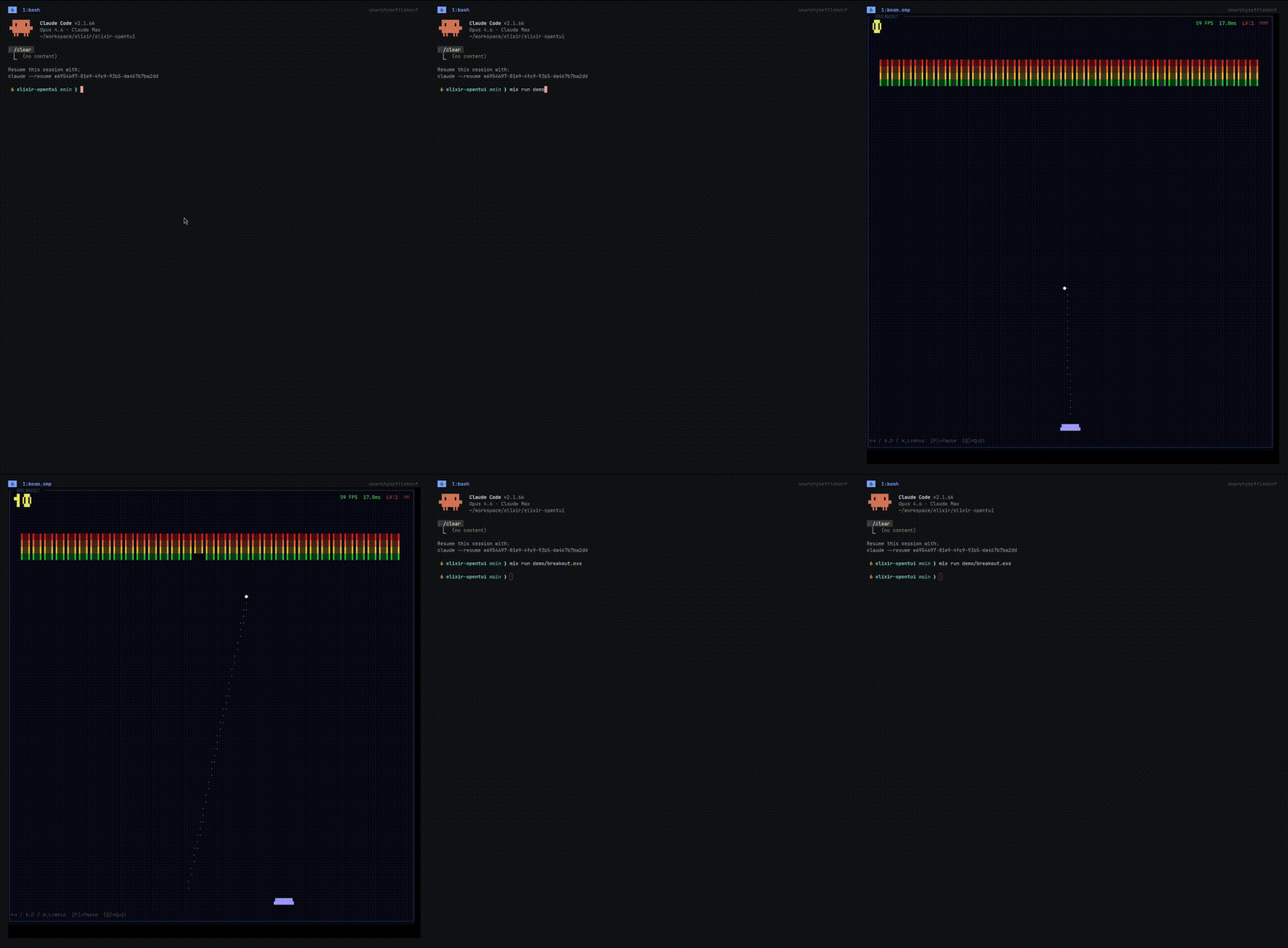
A demo pong game by using ElixirOpentui Canvas (claude build)
Features
- 15+ widgets — text input, select, checkbox, scroll box, tabs, textarea, code viewer, markdown renderer, diff viewer, and more
- Flexbox-inspired layout — rows, columns, padding, margin, grow/shrink, alignment, percentage sizing
- Diff-based rendering — pure Elixir cell buffer, minimal terminal output for minimal flicker
- Animation system — timeline-based with 25 easing functions, ~30 FPS live mode
- Syntax highlighting — via Makeup, supports Elixir and TypeScript
- Markdown rendering — via EarmarkParser, headings, lists, code blocks, blockquotes
- Full input handling — keyboard, mouse (SGR 1006), paste, Kitty keyboard protocol
- Terminal capability detection — progressive enhancement based on what the terminal supports
Installation
See the Getting Started guide for setup and requirements.
Optional dependencies
These are optional and only needed if you use the corresponding widgets:
{:makeup, "~> 1.2", optional: true}          # for Code widget syntax highlighting
{:makeup_elixir, "~> 1.0", optional: true}    # Elixir syntax highlighting
How it works
Every app follows the same pattern: init sets up your state, handle_event responds
to keyboard/mouse input by returning updated state (or :quit), and render builds a
declarative UI tree using the View DSL. The framework diffs the output and only redraws
what changed.
Under the hood, the rendering pipeline goes: element tree → flexbox layout → paint to cell buffer → diff against previous frame → emit minimal ANSI escape sequences. The Zig NIF backs the text area's rope buffer and editor view.
Demos
The demo/ directory has 11 runnable examples. Here are some highlights:
mix run demo/widget_gallery.exs   # all widgets in one view
mix run demo/text_area_demo.exs   # multi-line editor with undo/redo
mix run demo/code_demo.exs        # syntax-highlighted code viewer
mix run demo/markdown_demo.exs    # markdown renderer
mix run demo/diff_demo.exs        # unified and split diff views
mix run demo/animation_demo.exs   # timeline-based animations
mix run demo/breakout.exs         # breakout game
All demos use Ctrl+C to exit.
Available widgets
| Widget | What it does |
|---|---|
text |
Static text display |
label |
Single-line label |
input / TextInput |
Single-line text input with cursor, scroll, Emacs bindings |
textarea / TextArea |
Multi-line editor backed by a Zig NIF rope data structure |
select / Select |
Dropdown list with vim keys and fast scroll |
checkbox / Checkbox |
Boolean toggle |
scroll_box / ScrollBox |
Scrollable container |
tab_select / TabSelect |
Horizontal tab bar |
code / Code |
Syntax-highlighted code display |
markdown / Markdown |
Rendered markdown |
diff / Diff |
Unified and split diff views |
line_number |
Line number gutter with signs and colors |
ascii_font / AsciiFont |
Decorative ASCII art text |
View DSL
The View DSL gives you macros for building UI trees:
import ElixirOpentui.View
import ElixirOpentui.Color

box direction: :row, gap: 2 do
  panel id: :left, title: "Left", width: 20, border: true do
    text(content: "Hello", fg: green())
  end

  panel id: :right, title: "Right", width: 20, border: true do
    checkbox(id: :toggle, checked: true, label: "Dark mode")
  end
end
Styling
Style properties cover layout, colors, borders, and text attributes:
box width: {:percent, 50},
    height: 10,
    padding: {1, 2, 1, 2},
    bg: Color.rgb(30, 30, 50),
    fg: Color.white(),
    border: true,
    border_style: :rounded,
    border_title: "My Panel" do
  text(content: "Styled content", bold: true, fg: Color.rgb(100, 220, 100))
end
Layout: width, height, min_width, max_width, flex_grow, flex_shrink, flex_basis, padding, margin, gap, direction (:row/:column), justify_content, align_items, align_self
Visual: fg, bg, opacity, bold, italic, underline, dim, inverse, border, border_style (:single/:double/:rounded/:heavy)
License
MIT