AutocompleteInput
This is an autocomplete component for Phoenix LiveView. It uses a form associated custom element, which means it appears in your form params just like any other input element in your form. It is designed to be simple to integrate with live view and fully stylable via css.
Installation
If available in Hex, the package can be installed
by adding autocomplete_input to your list of dependencies in mix.exs:
def deps do
  [
    {:autocomplete_input, "~> 0.1.0"}
  ]
end
To install the autocomplete-input element javascript:
npm install --prefix assets phoenix-custom-event-hook @launchscout/autocomplete-inputAdd following to app.js
import '@launchscout/autocomplete-input'
import PhoenixCustomEventHook from 'phoenix-custom-event-hook'

let csrfToken = document.querySelector("meta[name='csrf-token']").getAttribute("content")
let liveSocket = new LiveSocket("/live", Socket, {
  longPollFallbackMs: 2500,
  params: {_csrf_token: csrfToken},
  hooks: { PhoenixCustomEventHook }
})
Usage
The AutocompleteInput.autocomplete_input is a standard functional component that accepts the following attributes:
id- (Required) The unique identifier for the input elementname- (Required) The form field name that will be used in paramsoptions- (Required) A list of options in the same form asoptions_for_select, eg{label, value}value- (Optional) The initially selected valuedisplay_value- (Optional) Text shown when the element renders in the intial closed state. An edit icon will be displayed next to itmin_length- (Optional, default: 1) Minimum number of characters required before showing suggestions
Events
The component sends two custom events that you can handle in your LiveView:
autocomplete-search- Triggered when the user types in the input field. The event payload contains:name- The name of the fieldquery- The current search text entered by the user
autocomplete-commit- Triggered when an option is selected. It is normally expected you would clear the list of options here. The event payload will contain the following:nameThe name of the fieldvalueThe selected value
autocomplete-open- Triggered when an autocomplete is opened. The event payload will containnameThe name of the field
autocomplete-close- Triggered when an autocomplete is cloase. It is normally expected that you will clear the list of options here. The event payload will containnameThe name of the field
Example
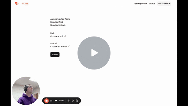
The component can be used within a form as follows:
<h1>Autocompleted Form</h1>

Selected fruit: <div id="selected-fruit"><%= @results[:fruit] %></div>
Selected animal: <div id="selected-animal"><%= @results[:animal] %></div>

<.simple_form for={%{}} phx-submit="submit" phx-change="change">
  <div>
    <label for="autocomplete-input">Fruit</label>
    <.autocomplete_input id="autocomplete-input" options={@fruit_options} value="apple" name="fruit" display_value="Choose a fruit" min_length={3} />
  </div>
  <div>
    <label for="autocomplete-input">Animal</label>
    <.autocomplete_input id="autocomplete-input" options={@animal_options} value="dog" name="animal" display_value="Choose an animal" min_length={3} />
  </div>
  <.button type="submit">Submit</.button>
</.simple_form>
The corresponding LiveView:
defmodule AutocompleteTestbedWeb.AutocompletedForm do
  use AutocompleteTestbedWeb, :live_view

  @fruit_options [{"Apple", "apple"}, {"Banana", "banana"}, {"Cherry", "cherry"}, {"Nanna", "nanna"}]
  @animal_options [{"Dog", "dog"}, {"Cat", "cat"}, {"Bird", "bird"}, {"Bearcat", "bearcat"}]

  import AutocompleteInput

  def mount(params, session, socket) do
    {:ok, socket |> assign(fruit_options: [], animal_options: [], results: %{})}
  end

  def handle_event("autocomplete-search", %{"name" => "fruit", "query" => value}, socket) do
    {:noreply, socket |> assign(fruit_options: @fruit_options |> Enum.filter(&label_matches?(value, &1)))}
  end

  def handle_event("autocomplete-search", %{"name" => "animal", "query" => value}, socket) do
    {:noreply, socket |> assign(animal_options: @animal_options |> Enum.filter(&label_matches?(value, &1)))}
  end

  def handle_event("autocomplete-commit", _params, socket) do
    {:noreply, socket |> assign(options: [])}
  end

  def handle_event("change", %{"autocomplete-input" => value}, socket) do
    IO.inspect(value, label: "change")
    {:noreply, socket |> assign(selected_value: value)}
  end

  def handle_event("submit", %{"fruit" => fruit, "animal" => animal}, socket) do
    {:noreply, socket |> assign(results: %{fruit: fruit, animal: animal})}
  end

  defp label_matches?(query, {label, _}) do
    String.contains?(String.downcase(label), String.downcase(query))
  end
end
This example is contained in the autocomplete_testbed folder and is used by the wallaby test.
Here's what it looks like in action:
autocomplete-input
For more details on the custom element this component wraps including styling information, see the autocomplete-input repo.